
ETHYLENE MIDDLE EAST CONFERENCE & EXHIBITION
ETHYLENE MIDDLE EAST CONFERENCE & EXHIBITION
DIVELLA
2020
Although the tonality, characteristics, and equity of a brand are more crucial, the visual elements still hold considerable importance within branding. When I had the chance to create a logo and design creative packaging for Divella, I gained valuable insights into logo design and the significance of incorporating symbolic features into brand visuals.
LOGO

Keeping the elements of the previous logo, the new logo is inclusive of the Italy flag. A more modern touch has been given to the new symbol with bolder colors and font and simpler illustrations of what the brand represents and sells. It is more straightforward as it gives the customers an idea of the products sold by the organization i.e, pasta. There are also lesser elements in the new logo to allow flexibility of application on various executions.
.png)
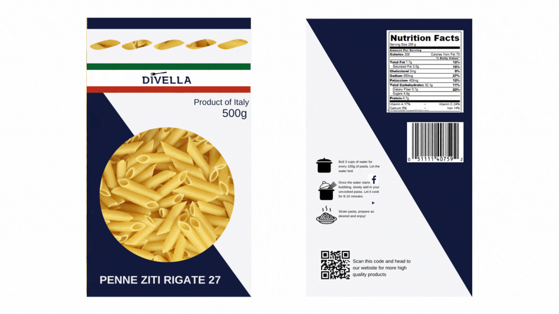
NEW PACKAGING
SEMIOTICS
On the face front:
-
Top window: 5 stars usually stand for being premium, in this case I have used the pasta shapes. They also reveal the product in it.
-
Colors around the Divella logo: Italian flag to state the brand's origin
-
Center window: Pasta revealed through a transparent packaging in the center with paper packaging around to stand for eco-friendliness.
-
Bottom left: Title of the type of pasta
On the back:
-
Nutritional Facts
-
Barcode
-
Visually appealing cooking instructions
-
Making customer aware of the social media that the brand is on
-
QR code for the consumers to head to Divella's official website